SENKO GTG DEVICE MANAGER · PRODUCT PROTOTYPE · 2026
WORK № 02GTG App Prototype
Historical data that doesn't hide the leak
A proposal and working prototype that lets safety engineers see a day of gas readings without averaging away the spike that matters.
- DATE
- JAN 2026
- CONTEXT
- B2B gas-detection distributor, one-person product team; proposal written for the Korean manufacturer
- ROLE
- Problem framing · Bilingual proposal (English / Korean) · UX · React prototype
- STACK
- React (single-file prototype, mock data)
THE 45-SECOND READ
The app for fixed gas detectors (SI-200, SI-301) showed only live readings. Engineers could not look back at what happened overnight. Routine tasks were slow too: calibration had no countdown timer, so engineers watched the clock, and setting a detector's time meant entering year to second by hand with a magnetic stylus.
DECISIONMake history the first priority, and design the chart around the question a safety engineer actually asks — did anything cross the alarm line, and when?
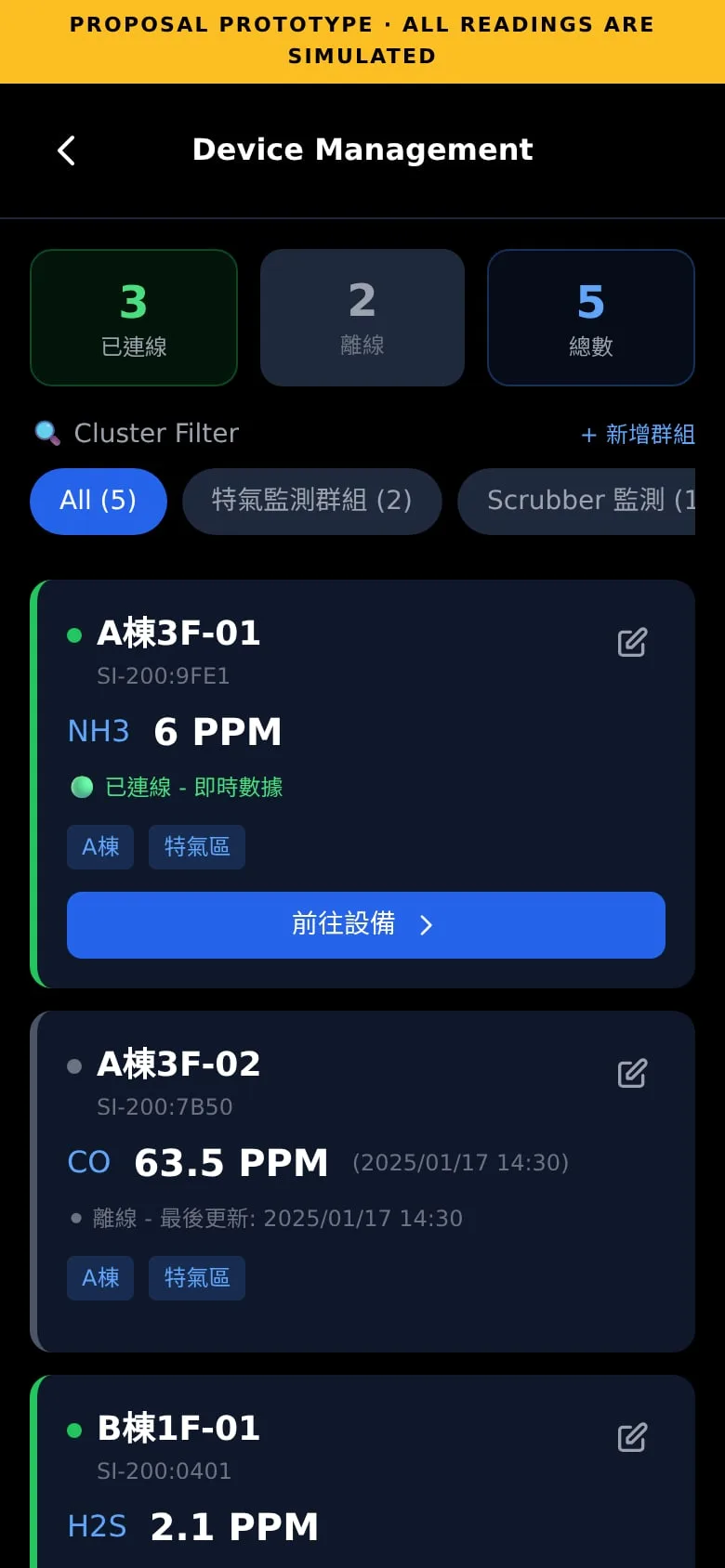
PRODUCTA clickable prototype (v6.0) covering the device list, device detail, historical data, calibration, time sync, rename, share and multi-device management.
STATUSDelivered to the manufacturer alongside several other improvement proposals. Their CEO showed particular interest in this one, and the manufacturer said it would take the proposal back for careful consideration.
THE PRACTICE / 01
An average can hide a leak
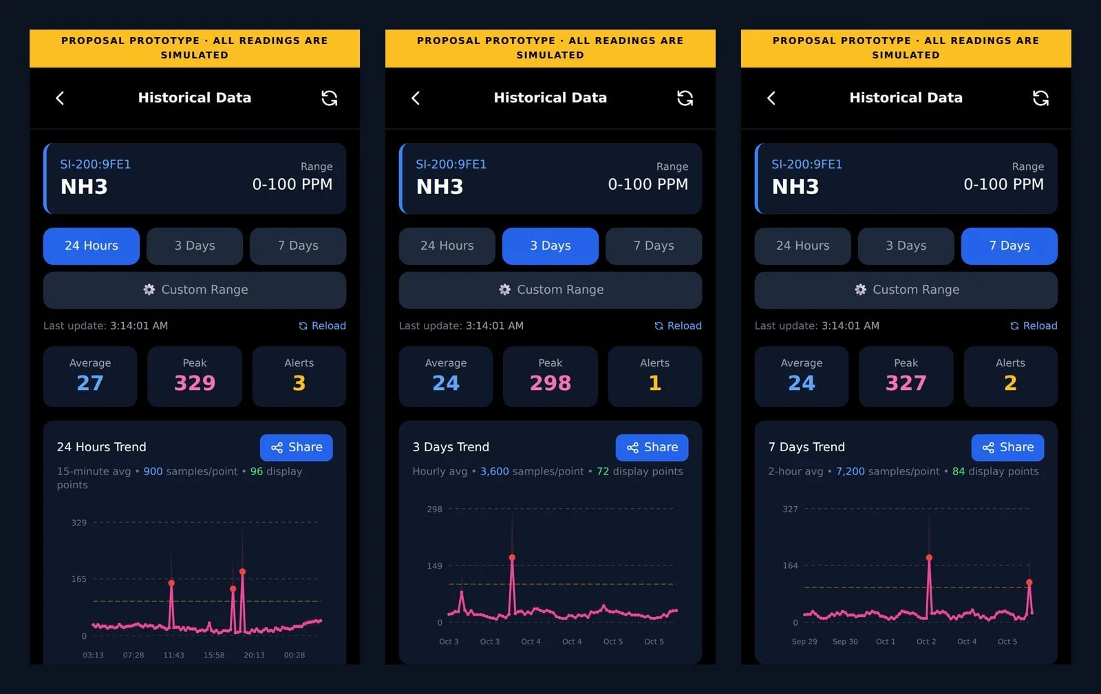
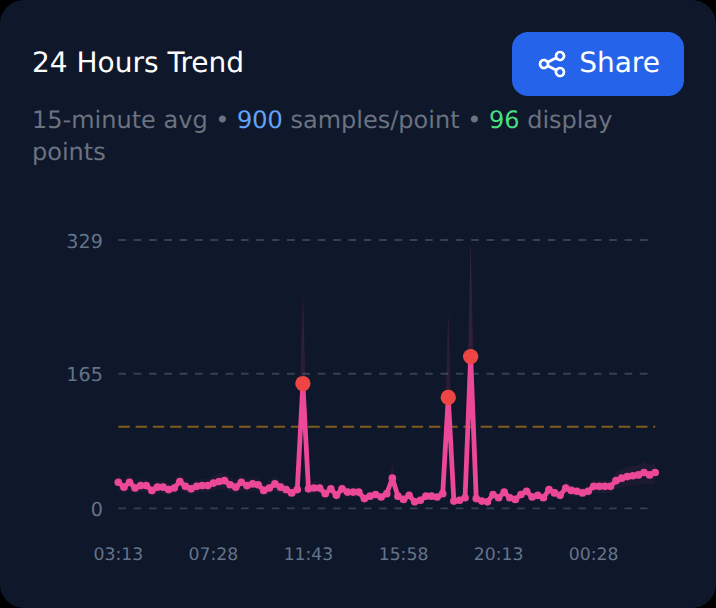
A day of one-second readings is 86,400 points; a phone screen fits about a hundred. The 24-hour view aggregates 900 samples into each of 96 points and says so on the chart (“15-minute avg · 900 samples/point”). Each point also carries the interval’s maximum, drawn as the top of a shaded band, so a short spike stays visible even when the average is low.
THE PRACTICE / 02
The alarm line is part of the chart
The alarm threshold is drawn on the chart, readings above it are marked, and the header shows average, peak and alert count. The first thing the eye finds is the event, not the trend.
Try it in the prototype beside this text: Manage Fixed Device → SI-200 → a device → the menu at the bottom right → History. All readings are simulated.
THE PRACTICE / 03
Three ranges, one mental model
24 hours, 3 days, 7 days and a custom range share one layout; only the aggregation interval changes (15 minutes, 1 hour, 2 hours), and the chart states which one it uses.
THE PRACTICE / 04
Fewer steps for routine work
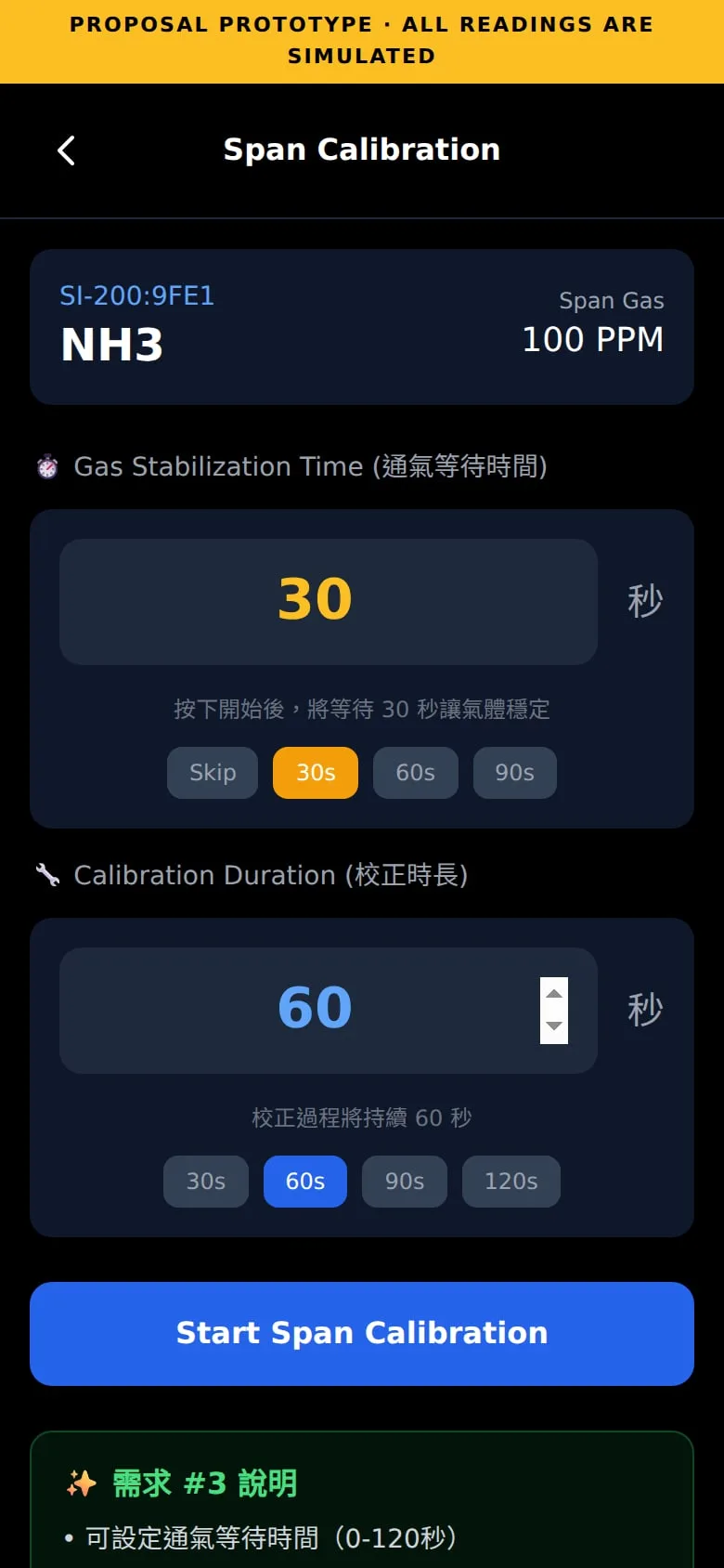
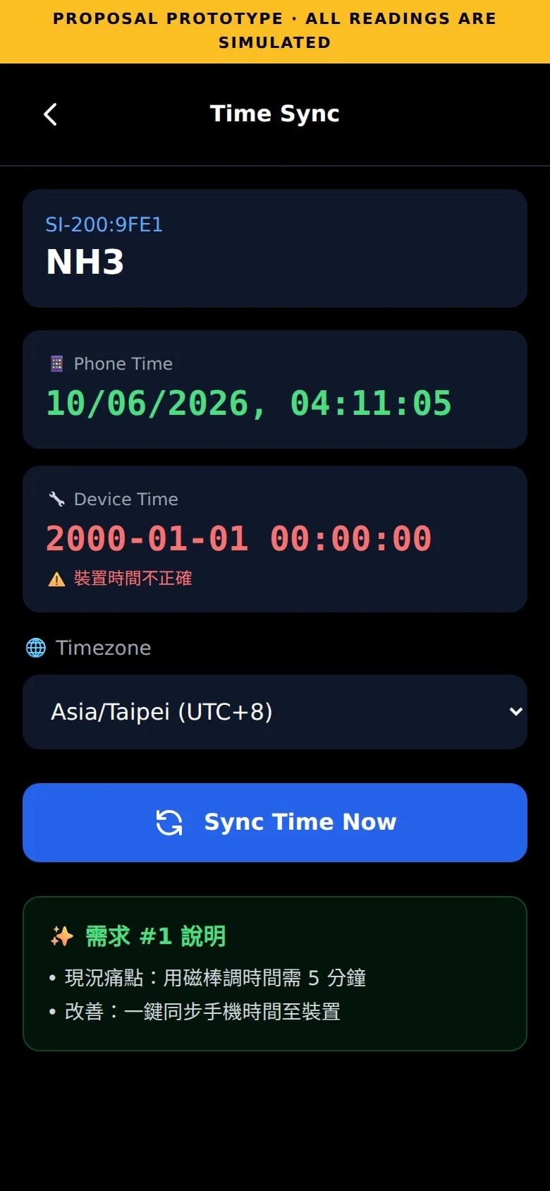
Time sync becomes one tap that sends the phone’s time over Bluetooth, instead of entering year to second with a magnetic stylus. Calibration gets a two-phase countdown — stabilization, then calibration — instead of an engineer watching the clock. Naming, tagging and grouping devices became short, guided flows.
NOTE ON DATA / OPEN
All readings in the prototype are simulated.
The prototype runs in your browser with generated data. It is not connected to any device.